NAOKO Vegan responsive website

Objective
-

-
NAOKO Vegan is a responsive recipe website offering 300+ delicious vegan and gluten-free (GF) recipes, each with a cooking time of 1 hour or less. The website features a personalized Recipe Box, a "Dirty-finger Free" mode to keep your device on while cooking, and a convenient filter to avoid unwanted ingredients, including allergens. Users can also read and write reviews.
Duration
February - April 2022 -
Role
UX/UI Designer, Art Director, Visual Designer, Content DesignerResposibilitie4s
Competitive Analysis, User Interviews, User Personas, Pain Points and Solutions, Usability Testing, User Flows, Wireframes, Prototyping, icon design, A/B Preference Testing, Mood Board, Style Guide, Responsive Web app DesignTools
Adobe XD, Photoshop, InDesign, UsabilityHub, PowerPoint, Zoom
Design Process
-
1. Empathize
User Research
Competitive Analysis
User Interviews
User Personas -
2. Define
Pain Points and Solutions
User Flows -
3. Ideate
Paper wireframes
DIgital wireframes
icon design
Style guide -
4. Prototype
Paper wireframe prototype
Lo-fi digital prototype
Hi-fi digital prototype -
5. Test & Iterate
Usability studies
A/B Preference Testing
Iterate and update designs after each usability study -
6.Finalize Design
Finalize Mobile Design
Design different sizes
Prepare for handover
Competitive Analysis
-
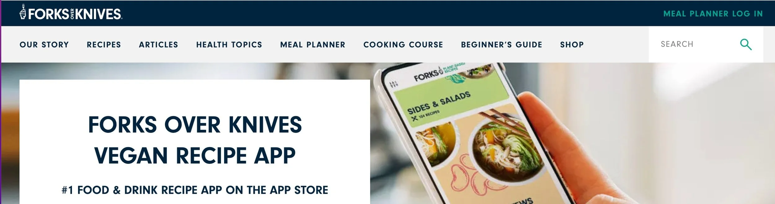
Forks Over Knives
Strength:
• Educational, Endorsed by Physicians
• 400+ vegan recipes
• Many success stories to prove veganism worksWeakness:
• Educational (not everyone wants to be converted.)
• No allergy information listed
• Not visually stylish
• UI design including colors can be improved
• Confusing and redundant navigation system -

Oh She Glows
Strength:
• An attractive free blog website
• 500+ vegan recipes and glowing
• Recipes are all marked for common allergens
• Lots of gluten free and nuts free options
• Good navigation systemWeakness:
• The web responsive app has advertisements
• The site design is overly feminine
• The personality is very White. -

Tasty
Strength:
• An easy to use no-nonsense recipe site
• Fun informative video which prevents your devise to go to sleep
• The search feature works well
• Good navigation systemWeakness:
• Too many large ads
• The annoying looping video
• No cooking time listed
• No allergy information listed
• Not enough vegan or gluten-free options
User Interviews
-
Patterns
• Everybody wants to find the desired recipe fast
• No social feature was expected
• Good visuals were appreciated
• Beginner cooks rely on reviews when choosing a recipe
-
Goals
• To find the desired recipe fast
• To find desired recipes by typing in ingredients in your hand
• To see entertaining and helpful visuals
• To read reviews to help user pick the best recipe
• Free
-
Frustrations
• Touching a mobile constantly with dirty fingers to wake it up while cooking
• My hand is injured. Can’t find a recipe that I can follow with only one hand
• Long educational videos and lengthy writings before you get to the recipes
• Annoying Ads, especially looped video Ads
• When they couldn’t find a desired recipe fast
• When the search result included their allergens
User Personas
-

Madison 38
Occupation: Online shop owner
Family: Lives with her sister
Lives: Seattle, WA
Dietary preference and challenges: Vegan, Gluten free, special diet for autoimmune disease“I don’t want to read an essay before cooking!”
She cooks all three meals at home for the whole household. Since she became vegan and gluten-free, her mysterious stomachache and joint pains have gone and her skins are glowing. She is working with a nutritionist to come up with a best diet.
She usually types in vegetables in her hand, vegan, gluten-free in Google Search Bar.
Goals:
To have a happy healthy lifestyleTo cook healthy vegan gluten-free sugar-free meals 3 times a day
To find easy-to-make vegan gluten-free recipes quick
Frustrations:
She hates ads, especially video ads which she can’t stop and keep looping.She hates reading long life stories before a recipe. She hasn’t got time!
She feels spending too much time preparing a meal.
-

Mark 55
Occupation: Animator and Educator
Family: Lives with a fiancė
Lives: Queens, NY
Dietary preference and challenges: No red meat, Gluten-free-ish, Lactose Intolerance.“Any recipe site doesn’t have this filter feature should be shot!”
He is a foodie. He wants to be entertained by funny food videos. He looks up for recipes when he hosts a house party. He follows tumblr.com for entertainment purpose.
Goals:
To eat healthily.To be entertained by fun images and videos.
To find delicious vegan gluten-free recipes quickly with the ingredients in my hand.
To use iPad in the kitchen to follow the recipe.
Frustrations:
Annoying videos made for young people trying to get over-excited about everything.Lengthy explanations made for beginners.
He sometimes cheats and eats a slice of pizza and ends up dealing with a bloated feeling and stomachaches for many hours.
Most vegetarian recipes use cheese that I can’t eat.
Pain Points & Solutions
-
Pain Points
Most vegan and gluten-free recipes take too much time and too complicated
Many recipe apps don’t let users filter for allergies
iPhone goes to sleep and automatically locks if you don’t touch the screen for 1 minute
Annoying ads and lengthy writings before the recipe section
-
Solutions
Satisfying delicious 300+ vegan and GF recipes with 1 hour or less cooking time
Great Search and Filter features for users to customize the search
Dirty finger-Free feature to keep your devise awake
Skip to Recipe button to access Recipe section quickly
Paper Lo-fi Wireframes (Prototype 1)
I created paper wireframes and used them for the first prototype to be used in the first usability test.
To view the first prototype, click here.

Digital lo-fi Wireframes (Prototype 3)
I created digital lo-fi wireframes and used them for the second prototype to be used in the second usability test. After the second usability test, I updated them to create this third prototype.
To view this prototype, click here.
I conducted three moderated Usability Studies by using zoom. There were 13 participants in total. For the first Usability Testing, I didn’t manage the participants too well. The participants were so thrown by the handwritten paper wireframe screens which still moved from page to page by their touch. They were too used to finished products. Some of the original key features were challenged to stay on. I made many adjustments on the way.
Usability Studies
Findings from Usability Studies
-
Prototype 1
Most participants had a problem finding Filter feature and the Main Menu.
Most participants were so thrown by the handwritten screens which moved from page to page by their touch.
Most participants were frustrated when they couldn’t do what they thought they could.
Anti-Ads, Anti-Essays, Anti-dirty fingers language was disliked since they were viewed as negative.
-
Prototype 2
Most participants didn’t have any problem to perform all the tasks.
Still some links were not connected correctly, not all the probable screens weren’t made, and this made one of them frustrated.
-
Prototype 3
Most participants felt the app was easy and fun to use.
Iterations
-
Iterations after study 1
I redrew all screens more neatly using a ruler.
The hamburger menu was made larger and moved from top left to top right in the top Navigation section to make it easier to find and to tap.
A filter icon was created and positioned next to the search bar at the top.
Bottom Navigation was added and it included home button, search button, filter button, and profile button.
Negative connotation “Anti-” language was replaced by “free.”
-
Iterations after study 2
Ads-free and Intro-free features were deleted.
Instead “Skip to Recipe” button was introduced.
Dirty finger-free feature stays in the Main Menu, however, it was swapped to be a toggle button. This change decreased 1 extra step for users to turn this feature on.
My Recipe Box and Write feature was added.
-
Iterations after study 3
Although bottom Navigation worked well on the test, it was removed from the last prototype to reduce redundancy. This can be put back for native app version.
Quick Recipe Screen was deleted since “Skip to Recipe” button satisfied the needs to get to the Recipe section quick.
Star ratings and cooking time were added to each recipe for users’ convenience.
User Flows

Style Guide


Naoko Vegan Responsive web design: Home

Naoko Vegan Responsive web design: Login

Naoko Vegan Responsive web design: Featured Recipe

Naoko Vegan Responsive web design: Filters

Naoko Vegan Responsive web design: Recipe
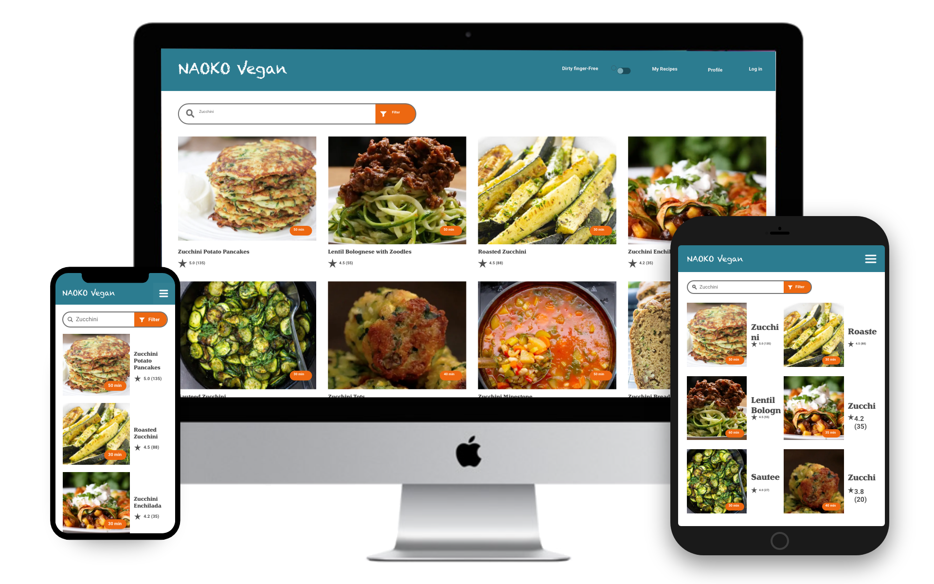
Naoko Vegan Responsive web design: Search
Takeaways
I acquired knowledge on designing responsive websites and conducting user research and usability tests in a more controlled manner.
I learned to think through the information architecture before proceeding with designing digital wireframes.
It is essential not to be overly ambitious with features and to keep them simple. When designing the first prototype, it's best to stick to Minimum Viable Products (MVPs)
Next Steps
In the future, I will exclusively test on digital wireframe prototypes. While testing with a lo-fi prototype was necessary, the prototype created with paper wireframes caused significant confusion and frustration among the testers.
Collaboration is crucial; in this project, I served as the sole UX/UI designer, but moving forward, I recognize the importance of working with a team of talented individuals to enhance this app.