green breaze is a peaceful restorative inspiring meditation app for mobiles.
Duration: September - October 2022
Role: UX Designer, UI Designer, Animator, Visual Designer
Responsibilities: Conducted competitive analysis, developed user stories, designed and created storyboards for animations, designed wireframes, crafted a style guide, icon design, executed animation with After Effect, and produced deliverables.
Target Audience: The app is targeted at anyone seeking an on-the-go meditation tool in their pocket.
Goal: The primary goal is to develop an easy-to-use meditation app that brings peace of mind to users wherever they are.
User Story
As a stressed commercial artist who works for a tech company, Michael wants a meditation app on-the-go, so that he can meditate anywhere anytime.
He opens the app. He sees the splash screen of clouds moving and already feels the breeze and calmness. “Breathe in” appears on the screen. Then the type fades out. “Breathe out” appears. He breathes in and out as the type appears on the screen. He likes it. A seed appears. It germinates quickly. Through baby leaves, a baby plant, and a young tree, it settles as a tree using a cloud as the leafy crown. He explores more. He selects Evening meditation. He selects a stream image with a 10-minute guided meditation. A guided meditation with water sounds starts. He starts his first meditation with this app.
Inspiring Competitors
The splash screen: A big orange ball with eyes casting down and a smiley mouth appears on the screen. It slowly enlarges suggesting he is breathing in. Then the Landing screen opens. I like this because it’s super friendly and not condescending like most New Age-style meditation apps. This animation already made me smile.
The same style of animations is scattered around in the app. Simple, smiley, friendly, playful, not serious, not condescending. I personally just want a meditation app, not a life coach. So, this playful light-hearted approach works for me.
The splash screen: “Breath in” with blue/green gradient background. After a few seconds, the type moves down and goes off the screen. A video of lakeside with evergreens and glacier background appears. The sound of water/bird chirping quietly follows in.
Daily Trip, Daily Calm, Daily Move, Daily Jay, and Find a daily program are the big selection buttons. Meanwhile, the lake video keeps playing in the background, which I think is creating a nice calm ambiance.
Daily Trip, Daily Calm, and Daily Move are intuitively understood. But what is Daily Jay? What is the Daily program? I guess if the user was interested enough, s/he will explore more to find out.
I like the image choice for the Daily Trip.
Selected Storyboards
Animation: Breathe in-and-out cloud
Animation: Seeding
Animation: Tree Logo
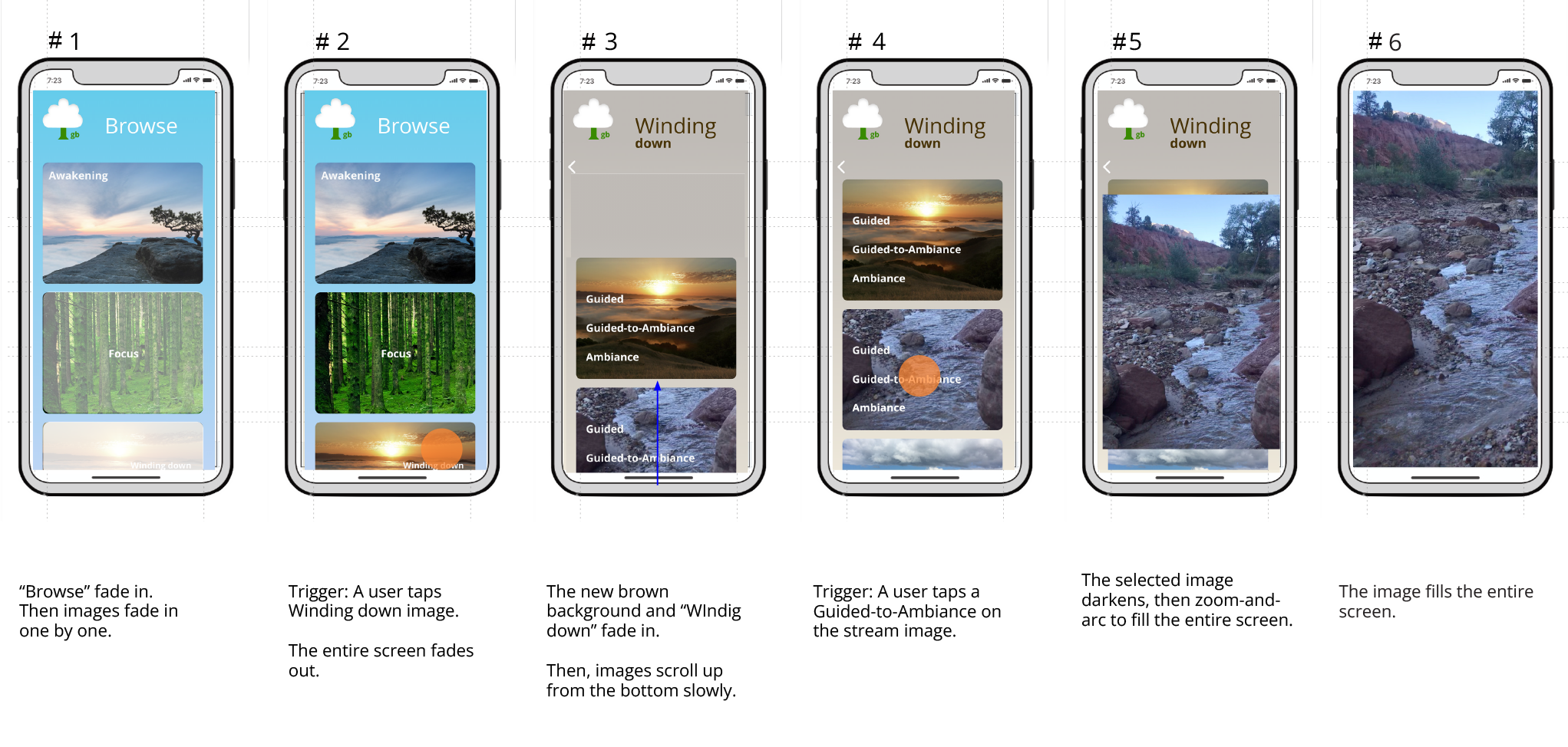
Animation: Transition from Browse to Evening Meditation to Play
green breaze hi-fi wireframes
green breaze
meditation app final design animation
Takeaways
-
What am I happy about?
I began the design process by inhaling slowly, holding my breath for a couple of seconds, and then exhaling slowly. This rhythm became my anchor throughout the meditation app's design.
I'm delighted with how the breathe-in and -out clouds turned out, as well as the final logo.
During this project, I learned the value of taking pauses at appropriate intervals
-
What were the challenges and how did I overcome?
Simplifying the animation storylines was crucial. After Effects offers incredible possibilities, and I initially found myself drawn to using intricate and cool effects. However, since this meditation app's purpose was to instill calmness in users, quick and flashy animations were unsuitable. I experimented with various quirky animations but ultimately chose to exclude most of them to maintain the app's slow and peaceful ambiance.
-
Next Steps
I plan to invest more time in determining the types of animations that are beneficial and suitable for the app.
Additionally, I will conduct a usability study and iterate on its findings to enhance the app's user experience.


