Objective

Save that bird is an online guide to help save wild birds and their habitat.
Project duration:
June 2023 to July 2023
The Problem
Users want to find a way to help wild birds survive and thrive but don’t know where to start.
The Goals
Our Save that Bird platform offers a quick rescue guide, allowing users to find volunteer opportunities and learn how to save wild birds and their habitats, which directly impacts the survival and return of migratory birds next year. By using this platform, users can enjoy bird-watching and contribute to the overall health of the world.
Target Users
Bird-watchers and bird-lovers aged between 25 and 70.
Role
UX researcher, UX designer, UI designer, Visual Designer
Tools
XD, Photoshop, Illustrator, PowerPoint, Zoom
Responsibilities
User research, wireframing, prototyping, usability study, user interface design
Creative Process
User research: summary
I conducted user interviews to understand the users I was designing for and their needs. One primary user group identified through research was adults who love bird-watching and want to help save wild birds and their habitat, as well as the world to an extent.
This user group confirmed initial assumptions about the "Save that Bird" app's users. The research also revealed that users want to contribute to making the city where they live a better place both environmentally and psychologically. Some of these users donate to different causes regularly but still desire to volunteer to make changes. Additionally, most of the users have encountered injured birds or baby birds in the past and struggled to find ways to save them.
User research: painpoints
-
1. Birds are suffering
Urban areas like New York City are witnessing significant suffering among wild birds.
Shockingly, close to half a million migratory birds perish annually due to collisions with windows in the city.
-
2. Donate or volunteer
Not everyone can easily donate due to financial constraints, but many still want to help and contribute to bird organizations in alternative ways.
-
3. Lack of 1-stop wild bird guide shopping
Online bird guides lack comprehensive information in a single place, and there is no centralized resource for finding bird-related volunteer opportunities. As a result, people have to conduct individual searches for each institution to discover their desired volunteer opportunities.
User research: personas
-
Kaori 51
JOURNALIST
“I wish they sent me the photo of the actual bouquet they sent to my Mom with the confirmation of shipment.”
Goals:
To find a desired bouquet and send it to her mother overseas on her birthday.The bouquet arrives fresh and matches what she selected.
Frustrations:
The flower shop’s website doesn’t take payment from overseas.The flowers delivered didn’t match the picture she saw online.
She can’t see what was sent.
-

Jason 46
SMALL BUSINESS OWNER/ARTIST
“I wish they have a number to call when I need help ordering.”
Goals:
To find a simple bouquet that his partner would like easily and send it to her as a surprise gift.The bouquet will be delivered in a good condition and make her happy.
Frustrations:
I can’t give the flowers to my partner by myself.The flowers delivered wilted and brown.
The selections on the website are limited.
Bird app information architecture

Paper Wireframes: Mobile
Taking the time to draft iterations of each screen of the app on paper ensured that the elements that made it to digital wireframes would be well-suited to address user pain points. And this would save time in the end.
Stars were used to mark the elements of each sketch that would be used in the initial digital wireframes.

Digital Wireframes
Home page
I designed a home page to show buttons to navigate to all the contents of the site.

Featured contents are filled buttons.
Enticing bird visual
All pages are accessible from Home page right away
Secondary features are outlined buttons.
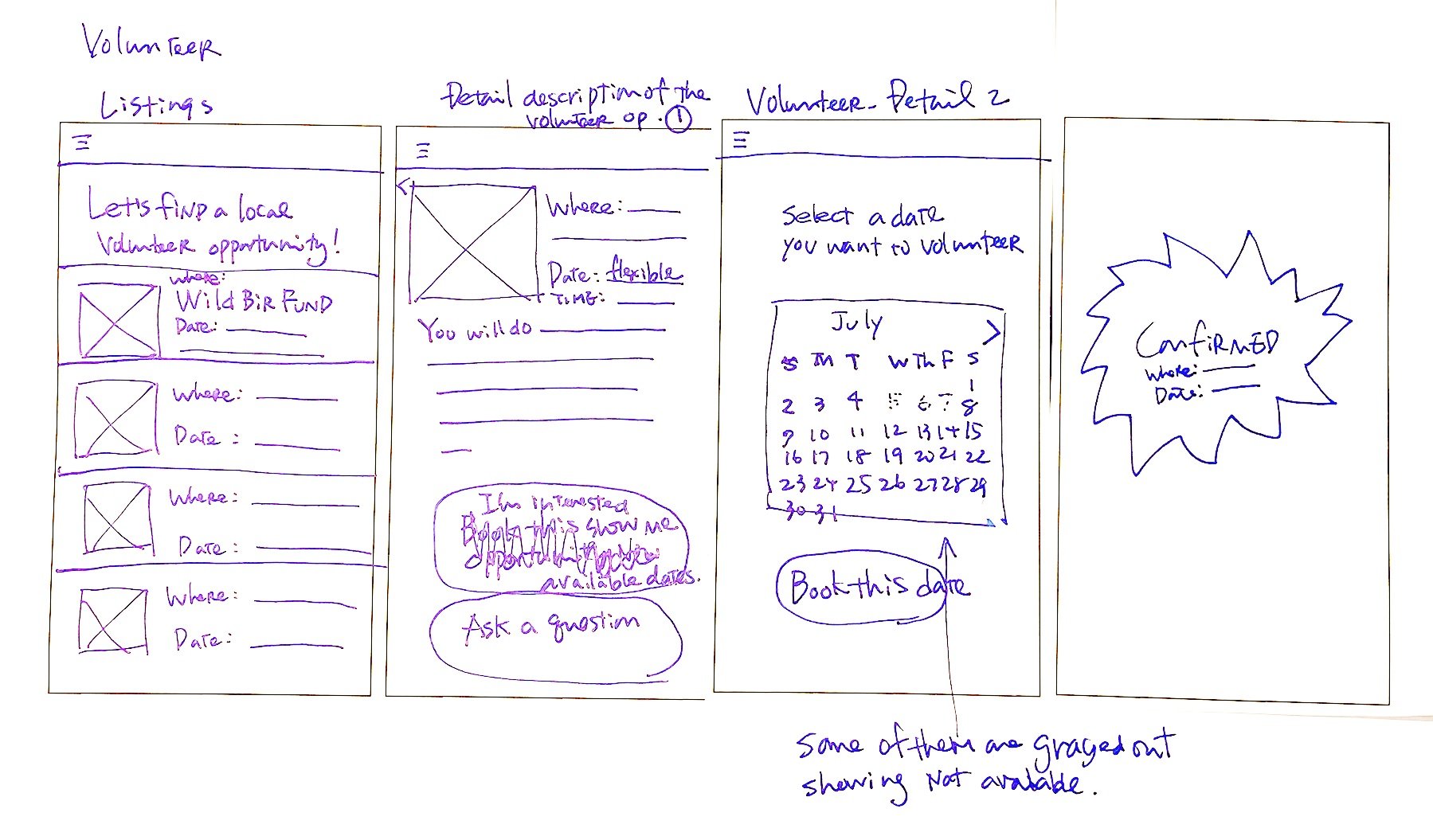
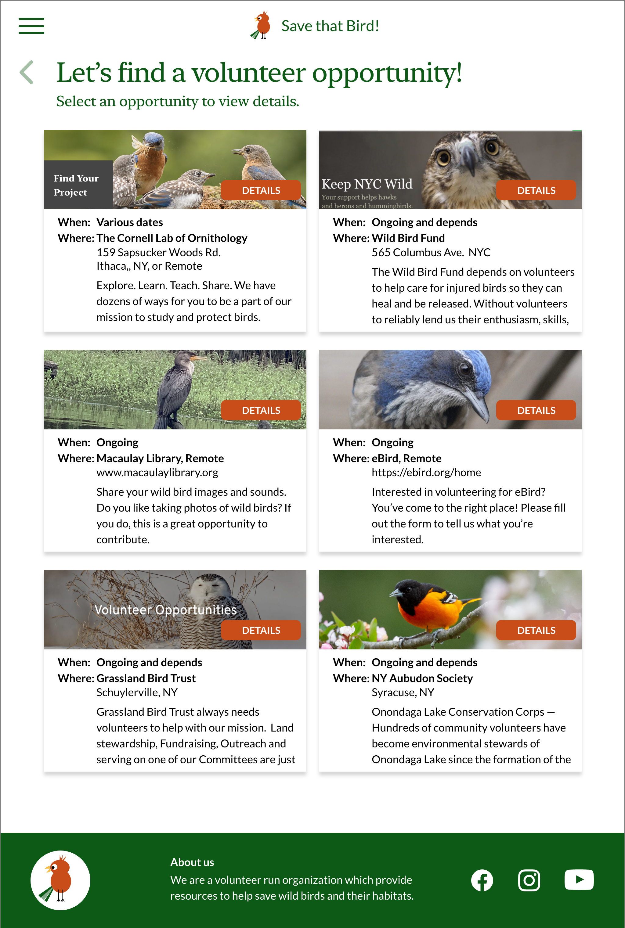
Detail page
I have created a Detail page with a Sign-Up button and a Send a Message button. This allows users to access all the information about the specific volunteer opportunity and register directly on the same page. Furthermore, if users have any questions before committing to sign up, they can ask them here as well.

Menu icon contains
quick access to filters, Profile, and existing orders
Users can read the
detail of the volunteer opportunity.
Enticing bird visual
Users can register right in the app.
Lo-fi Mobile Prototype
Using the completed set of gray scale digital wireframes, I created a low-fidelity prototype.
This lo-fi prototype is focused on finding a bouquet and the checkout process.
View the Save that Bird
low-fidelity prototype.

Hi-fi Mobile Prototype
After usability study 1, I analyzed the results and made changes to the previous wireframes. I introduced colors and typography to create a hierarchy, created hi-fi wireframes, and made them into a prototype to be used in the second usability study.

Paper Wireframes: Desktop
I sketched paper wireframes for the desktop before creating digital wireframes.

Hi-fi Desktop Prototype
After conducting, analyzing, and implementing changes to the hi-fi mobile prototype, I iterated on it by using the results to create a hi-fi web prototype to be used for the third usability study.

Usability study: study details
Research Questions
● How long does it take a user to find and sign up for a volunteer opportunity?
● What can we learn from the user flow?
● Is the Menu easy to find and usable?
● Are the main flows (reading the rescue guide, donating, and finding a volunteer opportunity) easy? Can we confirm these are the MVPs?
● Are the secondary features (Bird News, Bird Sightings, and Bird Feeding Tips) needed and helpful?
● Are there any other features users want to be included?
Methodology
● 15-40 minutes per session
● United States, remote, via Zoom or phone
● Moderated usability study
● Users were asked to perform tasks on a lo-fi or a hi-fi prototype
● Participants were asked to complete the System Usability Scale survey on Google Forms emailed after the study.
Participants
5 participants for each study
Study 1
Lo-fi mobile prototype
3 females and 2 males (aged 25 and 70).
Study 2
Hi-fi mobile prototype
2 females, 3 males (aged 25 and 70).
Study 3
Hi-fi web prototype
3 females, 2 males (aged 25 and 70).
1 participant with low vision
1 participant with low hearing
Usability study: Findings
-
Round 1 findings
5/5 participants found the app is easy to use.
3/5 participants found the volunteer flow needs some clarification.
2/5 participants found the smallest donate denomination $50 is too expensive.
3/5 participants found Bird Sighting flow confusing.
-
Round 2 findings
4/5 participants liked and were excited about this app
3/5 participants found the rescue guide chart flow confusing.
5/5 participants confirmed that Rescue Guide, Volunteer, and Donate are the MVPs. The rest are fun additions.
2/5 participants questioned about the Volunteer process. Should it be handled by each organization directly?.
-
Round 3 findings
Most participants wanted the input fields and radio buttons to be fully functional.
Most participants found the rescue guide chart flow on website was clear.
Mockups: Before and After Usability Studies
MVP buttons on home page
Early designs displayed similar weight on MVPs (Rescue Guide, Volunteer, Donate) and secondary features (Bird News, Bird Sightings). After the usability studies, I gave bright fill colors to the MVP buttons and decreased emphasis on the secondary buttons.
Before
After

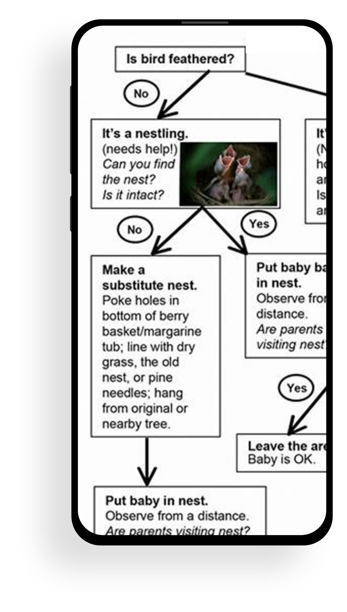
Baby bird rescue chart flow on rescue page
In the initial designs, the entire rescue chart was presented, but users faced difficulties on small mobile screens due to limited scrolling capabilities. This resulted in confusion among users. To address this, I conducted usability studies and reimagined the flow chart into five mobile-friendly screens, ensuring a consistent visual design across different screen sizes. For tablet and desktop versions, I kept the chart as a unified unit, taking advantage of their larger screen sizes to display most of the chart above the fold.
Before
After


Volunteer process
In the initial designs, users could browse, view detailed information, and book volunteer opportunities within the app, aiming for a convenient one-stop booking experience. However, usability studies showed that this approach was confusing and complicated the booking process. As a result, I simplified the design by displaying only essential information. Now, when users tap an opportunity card, they are directed to each organization's page directly. This streamlined approach significantly improved user clarity and simplified the booking process.
Before


After
Mockups: Mobile


I harmonized the mobile hi-fi prototype with the alterations made in the desktop version. The ultimate high-fidelity prototype offered more seamless user flows for the rescue guide, volunteer, and donation processes, effectively meeting user requirements.
Hi-fi Prototype: Mobile

Since different users would use different devices to access Save that Bird! app, I designed various sizes.
Mockups: Responsive web design
HOME SCREEN:
Mobile

Tablet

Desktop

RESCUE GUIDE SCREEN:
Mobile

Tablet

Desktop

VOLUNTEER SCREEN:
Mobile

Tablet
Desktop

Accessibility Consideration
Button Design: Made buttons large and bold for visibility, and plan to ensure each button has a clear and descriptive label for screen reader users.
Back Buttons: Included back buttons on every page with descriptive labels like "Back to Previous Page" for improved navigation.
Accessibility Guidelines: Followed Web Content Accessibility Guidelines (WCAG) for comprehensive accessibility improvements.
What I learned
I encountered challenges in ensuring the Baby Bird Rescue Chart's ease of use. For the mobile version, users preferred a simple "YES" or "NO" button navigation, which I integrated by redesigning the entire chart.
The Bird Sightings feature, while enjoyable, didn't align with the primary goal of serving as a rescue guide for wild birds. Thus, I downgraded it to a secondary feature, and instead of hosting discussions and data, I redirected users to an external non-profit organization, eBird's bird sighting page.
I adopted a similar approach for the Donate and Volunteer sections. Ultimately, I concluded that directing users to each organization's respective donate or volunteer page would optimize the flow and user experience.
Takeaways
Next steps
I plan to design additional wireframes for Profile/Sign in screen. I plan to design Feeding Tips, Bird News, and eBird Sighting for tablets and desktops as well.
I will consult the developing team about input field entering options. Then I will incorporate the changes to the next prototype.
I will conduct another usability study to make sure if I met all the requirements.