
Flower app
Flower app is an online flower shop that lets users connect to local florists all over the world in a few seconds. Users can shop for flowers for a loved one who lives far away with confidence.
Duration
March - May 2023
The Problem
Users want to find a perfect gift and send it with confidence to their beloved ones who live far away so that they would feel connected, but they are wondering if the flower shop is trustworthy.
The Goals
Our flower app will let users find the perfect bouquet and send it to a faraway location which affects how people feel connected, by connecting customers to local florists and enabling customers to place online flower orders easily and confidently.
Target Users
Adults who have loved ones living far away from them.
Role
UX researcher, UX designer, UI designer, Visual Designer
Tools
Figma, Photoshop, Illustrator, PowerPoint, Zoom
Responsibilities
User research, wireframing, prototyping, usability study, user interface design
Creative Process
User Personas
-

Heidi 43
FREELANCE VIDEO EDITOR
“I wish they sent me the photo of the actual bouquet they sent to my Mom with the confirmation of shipment.”
Goals:
To find a desired bouquet and send it to her mother overseas on her birthday.The bouquet arrives fresh and matches what she selected.
Frustrations:
The flower shop’s website doesn’t take payment from overseas.The flowers delivered didn’t match the picture she saw online.
She can’t see what was sent.
-

Steven 29
RESEARCH IN MATH
“I wish they have a number to call when I need help ordering.”
Goals:
To find a simple bouquet that his partner would like easily and send it to her as a surprise gift.The bouquet will be delivered in a good condition and make her happy.
Frustrations:
I can’t give the flowers to my partner by myself.The flowers delivered wilted and brown.
The selections on the website are limited.
Pain Points
Most online flower shops specialize local deliveries.
There are only two online flower shops in USA delivers internationally. And both of them don’t accept any foreign zip code as a delivery location.
The local florists overseas don’t accept foreign credit cards.
Users want to know if the right flowers were delivered in good condition.
Solution
Allow a variety of US payment methods including credit cards and debit cards
Connect customers to local florists, not only show pretty flowers.
Offer simple and easy-to-use filters.
Send a Delivery Confirmation to customers with a photo of the delivered flowers
Core User Flows

Paper Wireframes
Taking the time to draft iterations of each screen of the app on paper ensured that the elements that made it to digital wireframes would be well-suited to address user pain points. And this would save time in the end.
Stars were used to mark the elements of each sketch that would be used in the initial digital wireframes.
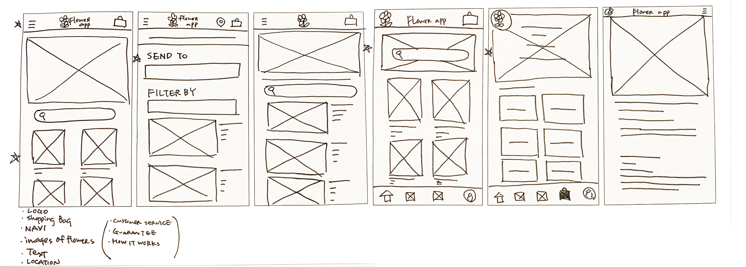
Digital Wireframes
Home page
Show the uniqueness of Flower app at a glance to capture users’ attention.
Users can search for flowers just by entering a city and a country or a zip code.

Menu icon contains quick access to filters, Profile, and existing orders
Enticing visual
Just by entering a location, users will see available bouquets in a few seconds.
Type any word to use as a filter
Enticing visual

Review page
I included the Review page as the last page of the payment process for users to review everything before placing the order which allowed users to correct anything.
Users can review and edit anything entered data before placing the order.
Lo-fi Prototype
Using the completed set of gray scale digital wireframes, I created a low-fidelity prototype.
This lo-fi prototype is focused on finding a bouquet and the checkout process.
View the Flower app
low-fidelity prototype.

Usability Studies
Round 1 findings
Filter feature is difficult to find
Note feature is confusing
Input fields are not working
Round 2 findings
Search function needs improvement
Checkout pages need clarification and familiar looking back buttons
Filter feature still needs improvement
Mockups: Before and After Usability Studies
Search on home page
Early designs allowed users to filter by location and other filters in one shot. But after usability studies, I reorganized the home page to focus on the delivery location. I eliminated the Filter field, and added a description for the action to clarify what they are searching for.
Before usability studies

After usability studies
Checkout process
The second usability study revealed the frustration about navigating within the checkout process. Although there was a sub-navigation bar at the top for this purpose, it wasn’t clear of this function to some users. I added a back button on the upper left corner on each page. I moved up the payment section first because it’s the most important information in the checkout process.
I made the sub-navigation bar taller and changed its color to blue, the button color in the app to suggest its function.

Before usability studies

After usability studies

Filters
The second usability study revealed accessibility challenges and confusion in the Filter feature.
I converted from the initial 2 step process filter to 1 step process filter, so that users can see all options on the same page.
Also, I added a radio button in front of each flower name which enabled users to choose more than 1 flower.
I added a word to each color dot, and enlarged the size of the color dots and spaces between them for users to tap easily.

Before usability studies


After usability studies
Mockups: mobile


Hi-fi Prototype
The final high-fidelity prototype presented smoother user flows for finding a bouquet and checkout. It also met user needs for seeing the local florist info before available bouquets.
View the Flower app
mobile hi-fi prototype.

Mockup: Desktop
Since different users would use different devices to access Flower app, I designed desktop sized wireframes.
View the Flower app
desktop hi-fi prototype.

Mockups: responsive design

Since different users would use different devices to access Flower app, I designed various sizes.
Takeaways
What I learned
I was surprised to hear “Searching for what?” about the Search button on the home page from one of the participants during the second usability study. Two other participants thought they were searching for florists, not for flowers. Since our app’s specialty is to connect users to local florists, searching for florists first makes sense.
People want to be forgiven. The Checkout process tested very well in the first usability study, showed frustration in the second usability study. Sometimes an app has to offer more than one way to do the same thing to be more inclusive.
Next steps
I will design additional wireframes for Profile, Customer Reviews, and Delivery Confirmation. These functions were already determined to be included in this app, but didn’t affect the core flow, so they were not designed at this stage. They must be designed before handing off.
I will consult the developing team about input field entering options. Then I will incorporate the changes to the next prototype.
I will conduct another usability study to make sure if I met all the requirements.